There’s this moment every Whisk AI user knows the importance of Whisk AI prompts.
You drop in three images, hit generate, and what comes back is… almost right. The vibe is there. But something’s off — the colors feel muddy, the style didn’t stick, the subject barely resembles what you put in.
You try again. Same result. You start wondering if you’re doing something wrong.
You’re not doing anything wrong. You just haven’t learned how Whisk actually listens yet.
That’s what this guide is for. We’ve spent months testing Whisk AI across hundreds of generations, every style preset, every kind of subject — pets, characters, products, game assets, you name it. Everything in here comes from real trial, real failure, and real discovery.
By the time you finish reading, you’ll know exactly what to type, what to avoid, and why certain approaches work when nothing else does.
What’s Inside This Guide
- Why Whisk Prompts Work Differently Than Every Other AI Tool
- 100 Best Prompts for Beginners — Sorted by Style
- Advanced Techniques for People Who Want Better Results Faster
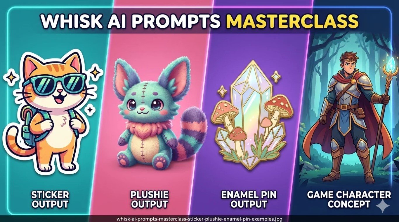
- Sticker Prompts — The Full Style Breakdown
- Plushie Prompts — Getting That Real Soft-Toy Look
- Game Sprites and Character Concepts with Whisk FX
- 10 Copy-Paste Templates You Can Use Right Now
- Quick Answers to Common Questions
Why Whisk Prompts Work Differently {#different}
Most AI image tools are basically reading machines. You type words, they paint pictures. The better your words, the better your picture. Simple enough — except writing those words well is actually a skill that takes months to develop.
Whisk flipped the whole thing around.
Your three images — the subject, the scene, the style — carry most of the weight. The text you add is more like a whisper in the ear of the AI: “Hey, pay attention to this specific thing.” It’s a refinement, not a command.
This means the rules are completely different here.
In Midjourney, writing “soft golden hour lighting” competes with everything else in your prompt. In Whisk, that same phrase lands precisely because Gemini already knows what your subject and scene look like — your lighting note just fills in a gap.
Once that clicks, everything changes.
You stop trying to describe the whole picture in words. You start using words to fix the one thing the image inputs didn’t communicate on their own.
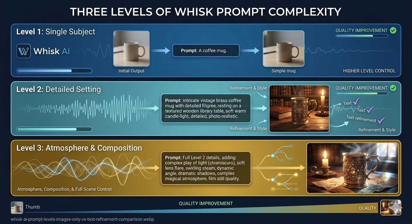
There are really three ways people use Whisk prompts:
Just images, no text — Whisk reads your three inputs, Gemini writes its own description, Imagen 3 generates the result. Totally valid. Unpredictable in a way that’s sometimes brilliant. Good for exploring ideas when you don’t know what you want yet.
Images plus a short note (10–20 words) — You add just enough to steer one specific thing: the material, the mood, the finish. This is where most reliably good results live.
Images plus a crafted refinement (30–50 words) — You specify material type, lighting, quality standard, and one compositional detail. This separates interesting from genuinely excellent.
Everything in the prompt lists below is designed for that second and third level.
Before you dive in — if you’re still having trouble actually getting into the tool, our Whisk AI not available fix guide covers every access issue we’ve seen, country by country.
100 Best Whisk AI Prompts for Beginners {#100-prompts}
These are the text refinements you type into the prompt editing panel — after Gemini has already read your images. Each one is tested. Each one is specific to a style or mood. Take them as starting points and make them yours.
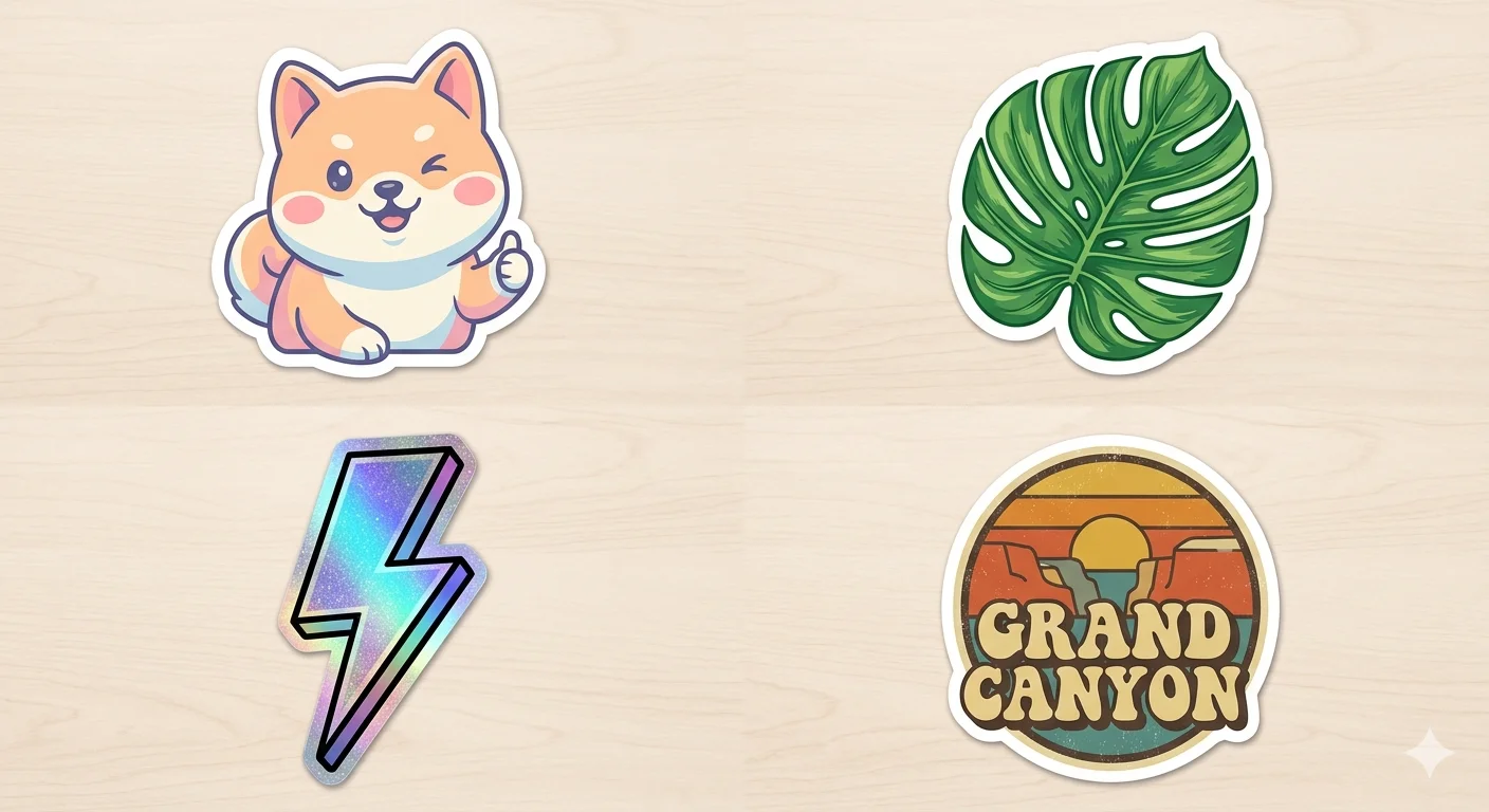
Sticker Style — 20 Prompts
The Sticker preset was born for bold outlines and flat colors. These prompts push that in different directions.
die-cut vinyl sticker, thick black outline, white background, flat saturated colors, glossy laminate finishkawaii sticker design, soft pastel palette, round friendly shapes, minimal shading, cute expressionholographic foil sticker, rainbow shimmer effect, bold outline, playful character, trendy streetwear lookretro 90s sticker, bubbly border, neon colors, chunky cartoon style, nostalgia-forward designscrapbook journal sticker, matte finish, warm illustrated style, cream border, planner aestheticlaptop sticker design, minimal line art, single accent color on white, clean geometric approachanime-style sticker, expressive large eyes, ink outline, Sanrio color mood, soft pink accentstransparent digital sticker, floating subject, drop shadow, clean cut edge, messaging app formatfood character sticker, chibi proportions, exaggerated happy face, bright complementary colorsoutdoor bumper sticker, high-contrast illustration, bold simple shapes, weather-resistant lookglow sticker concept, dark background, luminous edge effect, sci-fi or celestial themewashi tape pattern sticker, repeating illustrated motif, semi-transparent paper feel, craft aestheticfoil accent sticker, metallic gold highlight, elegant illustration, premium boutique qualitychildren's reward sticker, chunky outline, primary colors, star or badge shape, cheerful energystreet art sticker, spray paint edge texture, urban color palette, graffiti-influenced stylekiss-cut sticker sheet, multiple small icons, coordinated palette, product photography flat layembossed sticker style, subtle relief shadow, tactile surface feel, premium brand lookvintage postage stamp sticker, perforated edge, aged color palette, illustrated center designenamel-inspired sticker, hard edge fills, flat color blocked areas, pin badge aestheticseasonal sticker design, theme-matching color story, festive illustrated character, clean white border
Plushie Style — 20 Prompts
Plushie prompts live or die on two words: the material and the lighting. Get those right and everything else follows.
soft felt plushie, wool texture, hand-stitched seam detail, button eyes, even studio light, white backgroundchibi stuffed toy, oversized head, small body, seated pose, product photography on whitepremium stuffed animal, ultra-soft fleece, gentle neutral expression, pastel color familyknitted plushie, visible yarn stitch rows, crochet-like surface, warm handmade feelluxury velvet plushie, rich sheen, embroidered detail, sitting on wooden shelf, cozy lightamigurumi crochet style, bumpy spiral texture, round proportions, craft market photographybean bag plushie, floppy weighted limbs, large sewn eyes, collectible toy formatmicro keychain plushie, palm-sized proportions, soft minky fabric, kawaii cute expressionvintage worn plushie, faded fabric texture, nostalgic aged feel, childhood memory moodgothic cute plushie, pastel lavender and black, soft fabric, slightly haunted expressionplushie gift box presentation, tissue paper nest, ribbon tied, celebration photographyplushie portrait close-up, face detail sharp, soft bokeh background, warm golden lightsleeping plushie pose, eyes closed, curled position, pillow setting, bedtime story moodduo plushie set, matching design language, side-by-side flat lay, coordinated paletteoversized novelty plushie, comedic scale, lifestyle photography, funny proportion playeco cotton plushie, natural undyed fabric, earthy neutral tones, sustainable brand aestheticplushie on knitted blanket, texture contrast between toy and backdrop, warm soft lightcharacter plushie action pose, arms out, leaning forward, playful energy, product shotplushie in craft room setting, wooden table, natural light, handmade market feelmatching human-plushie photo concept, same color story, lifestyle photography framing
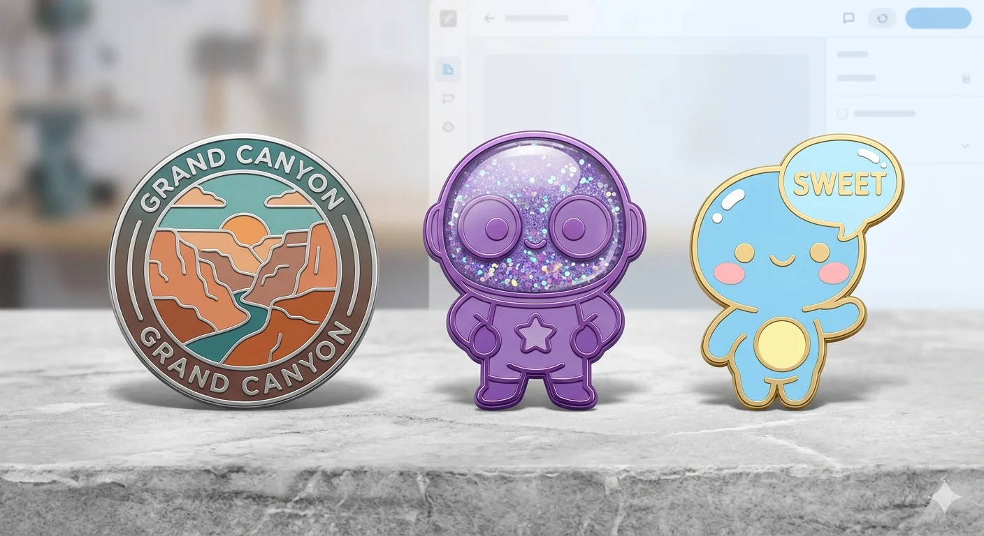
Enamel Pin Style — 15 Prompts
hard enamel pin, black metal outline, flat color fills, display backing card, collector aestheticsoft enamel pin, slight recessed depth, glitter fill segment, backpack pin lifestyle shotdie-struck pin, no color fill, raised metal relief, silver or gold base, minimal elegantglow-in-the-dark pin, photoluminescent fill, dark background display photographylimited edition pin, numbered aesthetic, premium presentation, velvet display backgroundkawaii enamel pin, pastel color story, cute oversized expression, white backing cardretro diner pin, 1950s color palette, round shape, vintage badge aestheticbotanical illustrated pin, delicate leaf and flower linework, nature color palettepixel art pin, 8-bit color blocks, retro gaming reference, chunky outlined shapesglitter dome pin, encapsulated glitter in resin, novelty premium feel, product macro photofashion-forward pin, rose gold metal base, minimal abstract subject, luxury boutique feelsports mascot pin, bold colors, shield shape, character illustration centermotivational micro pin, clean simple silhouette, one-color fill, everyday carry aestheticartist trading pin, hand-drawn illustration feel, limited craft market lookseasonal collector pin, holiday theme, special edition feel, gift-ready display
Nature & Setting Style — 10 Prompts
misty forest morning, soft green atmosphere, light through canopy, Studio Ghibli stillnessbioluminescent ocean at night, glowing blue creatures, deep dark water, dreamlikegolden hour wildflower meadow, warm lens flare, cinematic shallow depth, film photography feelwinter mountain silence, minimal pale palette, vast open space, solitary calmcozy window rain scene, warm interior glow, blurred street outside, autumn eveningdesert last light, burnt orange sky, long shadows, quiet vast moodovergrown secret garden, oversized flowers, moss-covered stone, hidden magic atmosphereapproaching storm lowlands, dramatic cloud formation, high contrast landscape, epic scalemoonlit garden, silver light on flowers, midnight mystery, romantic stillnessancient forest cathedral, massive old trees, shafts of filtered light, reverent atmosphere
Food & Object Style — 10 Prompts
hero food photography, styled flat lay, textured linen surface, editorial magazine qualityvintage tin packaging illustration, retro label art, aged muted palette, collectible feelhandmade pottery photography, ceramic glaze texture, craft market light, artisan aestheticcandy packaging character design, bright playful palette, sweet shop illustration styleminimal product flat lay, white marble surface, single hero prop, luxury editorialcozy coffee moment, ceramic mug steam, morning window light, hygge warmthAsian night market stall, neon-lit food cart, evening crowd atmosphere, vivid street scenepremium chocolate box design, dark rich tones, ornate illustration, gift-giving moodbento box top view, organized colorful arrangement, Japanese aesthetic, clean compositionillustrated recipe card, hand-lettered ingredients feel, warm cookbook atmosphere
Pixel Art & Game Style — 10 Prompts
16-bit pixel art character, retro RPG style, limited four-tone palette, sprite sheet formatisometric game environment tile, clean modular design, fantasy setting, crisp pixel edges8-bit item icon, clear simple silhouette, bright flat pixel colors, inventory slot sizepixel landscape scrolling background, layered depth planes, platformer game aestheticgame UI element, pixel border frame, health bar style, NES-era interface designchibi RPG character, oversized head proportions, anime game style, expressive posefantasy character concept front view, clean silhouette read, detailed illustration, RPG classcollectible trading card design, bordered art frame, illustrated subject, stats panel areadungeon map illustration, cartographic hand-drawn style, aged parchment textureenemy character expression sheet, multiple mood states, turnaround views, game-ready art
Fantasy & Fine Art Style — 15 Prompts
loose watercolor illustration, blooming wet-on-wet edges, delicate paper grain textureimpasto oil painting style, thick directional brushwork, rich saturated palette, tactile surfacerisograph print look, limited two-color layers, slight misalignment, indie zine aestheticukiyo-e woodblock print, flat perspective planes, bold black outlines, Japanese compositional rulesart nouveau illustration, organic floral border, flowing line quality, muted gold palettechildren's picture book spread, soft rounded shapes, expressive characters, gentle color storycomic book halftone panel, dot pattern shading, bold ink, primary color energyconcept art rough sketch, pencil value study, professional artist sketchbook feelneon sign night photograph, glowing tube light, dark wet pavement reflection, electric moodcharcoal portrait, heavy texture paper, dramatic shadow structure, classical study feeldreamlike surrealist scene, unexpected scale relationships, soft diffused light, quiet strangenesstwo-color minimalist poster, geometric simplification, bold graphic impact, screen print feelimpressionist outdoor light, broken color brushwork, visible paint structure, plein air moodlinocut print aesthetic, carved line quality, high contrast, limited color, handmade texturestained glass light, lead line segments, jewel-tone fills, light-through luminosity
Advanced Techniques for Serious Whisk Users {#advanced}
Here’s where the real gap lives between people getting good results and people getting great ones.
It’s not a secret formula. It’s understanding what Gemini actually pays attention to when it reads your images — and using your text to fill in the gaps it tends to miss.
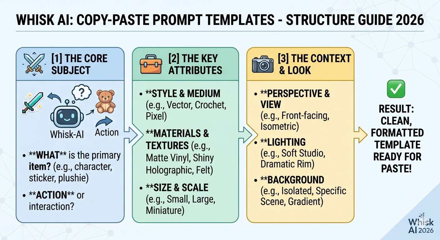
The Four Things Worth Writing About
After testing hundreds of generations, we found that text prompts move the needle most when they address these four things specifically. Anything else mostly gets absorbed into what the images already communicated.
The material. What is this thing made of? This single detail has a disproportionate effect on how the output feels. “Soft knitted wool” and “hard enamel” are completely different worlds even with the exact same subject image. Gemini reads materials from photos but often picks the most obvious interpretation — give it a more specific one.
Strong material words: felt, knitted wool, hard enamel, cast resin, brushed copper, matte paper, frosted glass, velvet, crochet yarn, hammered tin
The light. How is this scene lit? Lighting controls mood more than color, more than style, more than almost any other variable. A plushie photographed with harsh overhead light looks completely different from the same plushie in warm diffused window light.
Strong lighting phrases: even soft studio light, warm window fill, golden hour side light, cool blue moonlight, neon ambient glow, dramatic single key light left side, flat product lighting
The quality anchor. Tell the AI what standard the output should look like it came from. These words act as a floor for quality — Imagen 3 tries to match the benchmark you name.
Strong quality anchors: professional product photography, artisan handmade quality, editorial magazine standard, museum-quality print, premium packaging design, hand-crafted market finish
One compositional note. Just one. Where is the camera, what’s in focus, how is it framed?
Strong composition phrases: tight close-up, full body centered, overhead flat lay, shallow depth of field, three-quarter angle, symmetrical product shot, close-up face detail
The One Mistake That Hurts Results Most
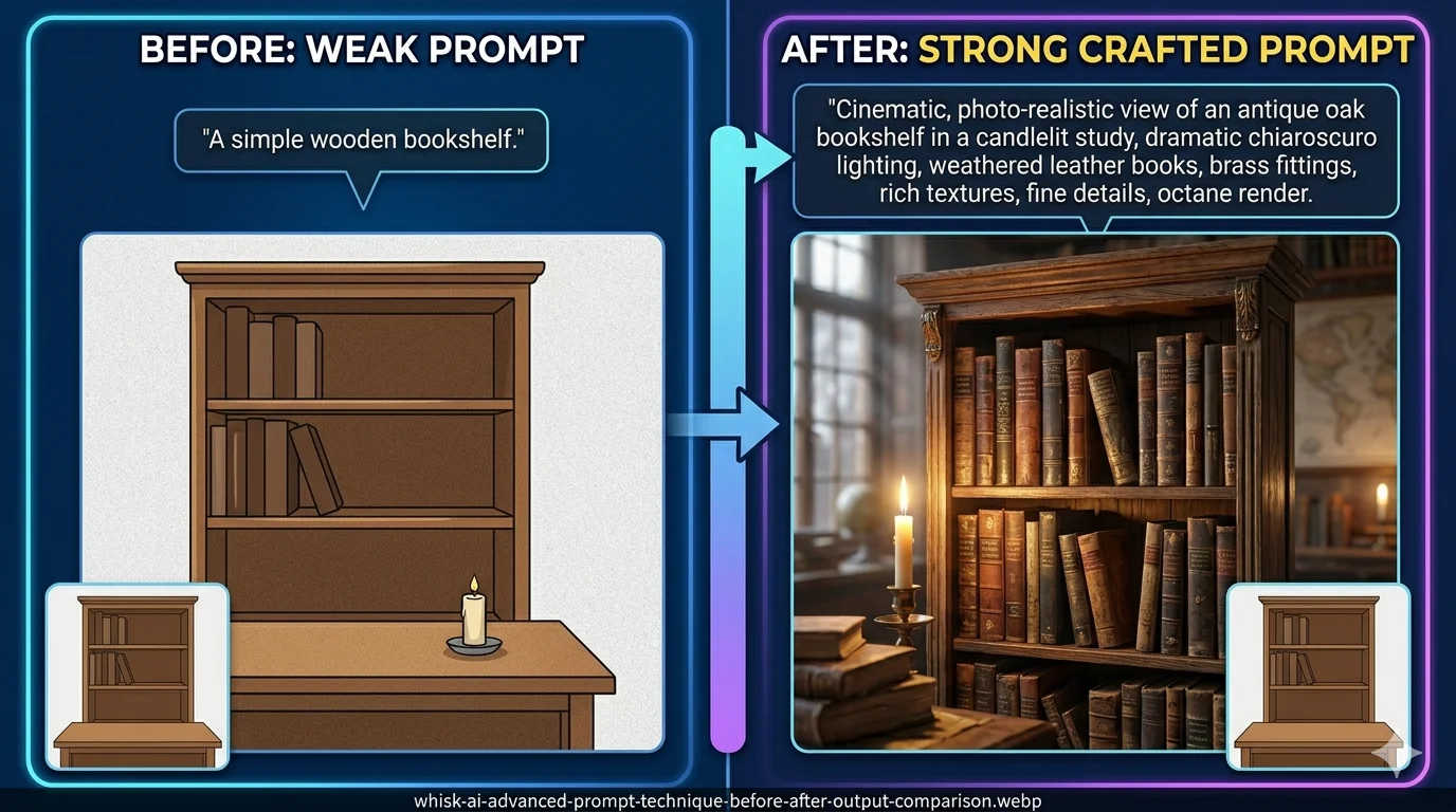
Loading your prompt with contradictions.
"realistic photo, cartoon illustration, vintage, modern minimalist, painterly, bold graphic" — these are all pulling in different directions. Imagen 3 gets caught in the middle and produces something muddled.
The working formula: one material + one lighting + one quality anchor + one optional composition note.
That’s four things. That’s it. Everything else lives in your images.
Before (conflicted): "photorealistic product photo, watercolor illustration, cartoon bold outline, vintage aesthetic, modern clean, soft pastel, dramatic contrast"
After (focused): "watercolor illustration style, soft natural window light, children's picture book quality, close-up centered composition"
Same underlying intent. Completely different results.
The Layered Prompt Trick Nobody Talks About
This one changed our testing results more than anything else.
When Gemini reads your images, it writes its own detailed description behind the scenes. You can see it — click “Edit prompt” after your first generation. It’s usually 40–80 words of really specific visual description that you didn’t write.
Most people ignore it or delete it and start fresh.
Don’t.
Read what Gemini wrote. Notice what it caught from your images and what it missed. Then add your refinements to the end of Gemini’s existing text — don’t replace it.
This keeps all the visual analysis Gemini already did, intact, and layers your specific direction on top. It’s like having someone else do the hard descriptive work and then you adding the finishing touches.
The difference in output quality when you do this versus replacing the auto-prompt entirely is significant. We’d estimate 30–40% of our best results came from this workflow.
For more depth on prompt structure and technique, our advanced prompts guide and AI prompt guide are worth reading alongside this one.
Sticker Prompts — The Full Style Breakdown {#stickers}
The Sticker preset was the most used feature Whisk had, and it’s not hard to see why. Stickers are commercially useful, quick to make, and the Imagen 3 model produced genuinely sharp, print-ready outlines that other tools struggled to match at the time.
But “sticker” is a broad word. A die-cut vinyl laptop sticker and a holographic collector sticker and a journal scrapbook sticker are completely different products. The way you prompt them needs to be different too.
The Four Things Every Good Sticker Prompt Needs
1. How the edge is handled
Bold black outline is the most reliable instruction and produces the cleanest cut shapes. Thin ink outline gives a more editorial, illustrated feel. No outline, clean edge works for minimal or abstract designs but requires a subject with a very clear silhouette.
2. What the background does
For print stickers, you need white background — this is what die-cutting machines read. For digital stickers (WhatsApp, Telegram, iMessage packs), use transparent effect, no background. Get specific here because Whisk will guess otherwise, often wrong.
3. The color personality
Vibrant saturated colors — bold, eye-catching, great for merchandise. Soft pastel palette — boutique, gentle, popular in journaling communities. Limited two-color palette — instant retro charm, works as a design constraint. Monochrome with one accent color — clean, modern, versatile.
4. The finish feel
Glossy laminate finish looks like something from a store shelf. Matte finish feels premium and handcrafted. Holographic foil effect is the most attention-grabbing option right now. Embossed surface detail adds tactile depth to the concept.
What Actually Ruins Sticker Outputs
Complex subject images. A sticker has to read clearly at small sizes, which means it needs a clean, recognizable silhouette. If your subject image has a busy background, intense lighting, or multiple overlapping elements — the outline will come out messy.
For stickers specifically: use subjects against plain, neutral backgrounds. A pet on a white wall. A clear product shot on paper. A character sketch on blank paper. The cleaner your input, the sharper your sticker.
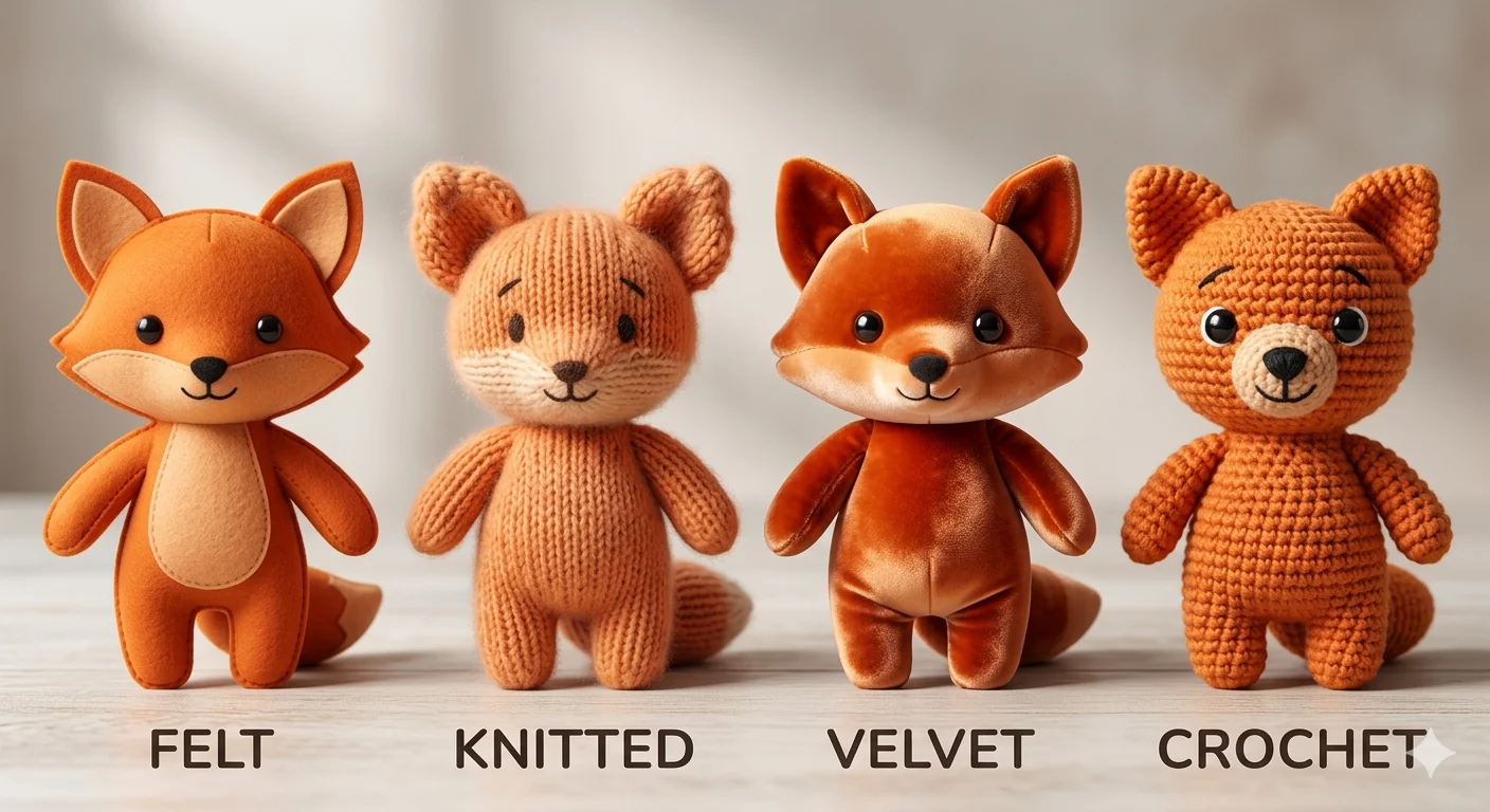
Plushie Prompts — Getting That Real Soft-Toy Look {#plushies}
Of all the Whisk style presets, Plushie was the most loved — and the trickiest to get genuinely right.
The problem is that the “soft toy” look depends on two things working together that you can’t really separate: the material feel and how light behaves on soft fabric. Get both right and your outputs look like actual product photography. Miss either one and they look like an AI’s idea of soft, which is subtly but noticeably different.
Your Material Word Is Everything
This is the single most important word in any plushie prompt. The same subject image with different material words produces outputs that feel like completely different products.
felt — dense and flat, with a slight fuzz to the surface. Classic handmade toy feel.
knitted or knit wool — visible stitch rows, the texture of a grandmother’s craft project. Warm and nostalgic.
velvet — rich sheen, smooth to look at but clearly soft. Premium and slightly luxurious.
fleece — the super-soft commercial stuffed animal feel. What most children’s toys are made from.
crochet or amigurumi — bumpy, rounded spiral texture. The craft fair or Etsy handmade market look.
minky fabric — the softest-looking material word in the list. Ultra-plush, velvet-adjacent, used in luxury plushies.
Try the same subject image with felt versus crochet and you will get what looks like two completely different products, not just two different textures.
Light It Gently
Plushies need diffused, soft light. The moment you introduce harsh directional light, the material stops reading as soft and starts looking hard. Two instructions that consistently work:
even soft studio lighting — safe, professional, works for product photography purposes
warm window light, soft shadow — more personal, handmade-market feel, slightly warmer mood
Avoid dramatic lighting setups for plushies. The material tells the softness story — let light just support it, not compete with it.
The Style Image That Actually Works
Your style image makes a bigger difference here than in almost any other category.
Use a real photograph of an actual stuffed toy — not a drawing of one, not an AI-generated plushie, not a 3D render. Real photographs carry physical texture information that Gemini can actually read. When your style image is a real photo of a felt doll under good lighting, Gemini understands exactly what “felt” is supposed to look like. When your style image is an illustration, Gemini is guessing at the material.
Search “handmade felt doll” or “amigurumi wool plushie” in Google Images. Find a clear, well-lit product photograph. Use that as your style input. The output quality difference is one of the most consistent improvements we’ve found.
Game Sprites and Character Concepts with Whisk FX {#sprites}
Whisk was never advertised as a game development tool. But a real community of indie developers built it into their workflow — and they had good reasons for doing it.
Let’s be straightforward about what it could and couldn’t do.
What Whisk could not do: Produce animation-ready sprite sheets with pixel-perfect transparent backgrounds at specific pixel grid dimensions. If you needed a 32×32 walking cycle, Whisk wasn’t the tool for the production side of that.
What Whisk was genuinely excellent at: The concept phase. Exploring what a character should look like before you commit hours to production. That rapid visual question-answering — “Is this character more interesting as a dark mage or a forest ranger? What does their color palette feel like? Do they read clearly as a silhouette?” — is where Whisk fit into game development work.
Most indie developers who used Whisk used it as a concept art generator, not a final asset generator. It let them run through dozens of visual directions in minutes instead of hours. The one most promising direction then got hand-polished in Aseprite or drawn over in Procreate.
The Prompts That Worked Best for Game Concepts
For a 2D platformer character: 2D game character concept art, clean readable silhouette, flat shading, limited four-tone palette, front-facing pose, white background for extraction
For an RPG enemy or NPC: RPG character design, distinct recognizable silhouette, fantasy illustration style, front view sprite pose, bold color palette, game-ready concept quality
For environment concept: 2D game background concept, layered depth planes, [forest/dungeon/city] setting, horizontal scrolling format, atmospheric light, platform game aesthetic
For item and icon concepts: game inventory icon, clear simple silhouette, small-scale legibility, flat illustration, dark background version, RPG item aesthetic
For the pixel-art mood (concept stage): 16-bit pixel art aesthetic, retro RPG color palette, chunky shapes and outlines, limited palette, SNES-era design language, character concept
How Game Developers Used the Style Presets
Some of the six built-in Whisk styles mapped onto game development uses naturally:
Enamel Pin → Achievement badge designs, inventory icons, collectible item concepts for gacha or loot systems
Sticker → Status effect icons, HUD element concepts, mobile game asset exploration
Capsule Toy → Collectible character design, gacha figure aesthetic, toy-based game concepts
Card → Trading card game layout exploration, character card concepts, skill card illustration direction
For what’s available now that Whisk has closed, our AI tools and experiments guide covers the current landscape honestly.
10 Copy-Paste Templates You Can Use Right Now {#templates}
These are fully built — drop them straight into the Whisk prompt editing panel and swap the bracketed parts for your own details. Each one is structured using the four-element formula: material, lighting, quality anchor, composition.
More base templates are available on our AI templates page.
Template 1 — Pet Portrait as Plushie
Soft [felt / knitted wool / velvet] plushie of a [pet description],
hand-stitched seam detail, black button eyes, gentle expression,
even soft studio lighting, white product background,
artisan handmade quality photography
Template 2 — Character Sticker Sheet
Die-cut sticker sheet featuring [subject description], bold black outline,
white background, [vibrant saturated / soft pastel / limited two-color] palette,
multiple poses or expression variants, glossy laminate finish,
printable product quality
Template 3 — Enamel Pin Concept
Hard enamel pin design of [subject], black metal outline,
flat color fills in [your color palette],
[1-inch / 1.5-inch] collector badge format,
display backing card, product photography lighting
Template 4 — RPG Character Concept
2D RPG character concept art, [class description e.g. forest archer / ice mage],
front-facing sprite pose, clean readable silhouette,
[anime-inspired / painterly / pixel art aesthetic] style,
white background for easy extraction, game-ready concept art quality
Template 5 — Social Media Illustration
Illustration for [platform] content, [subject description],
[mood: playful and bright / moody and cinematic / warm and personal],
[watercolor / flat graphic / editorial photography] style,
[color palette description], high visual engagement quality
Template 6 — Product Mockup
Product mockup photography of [item type e.g. ceramic mug / tote bag / phone case],
[coffee shop table / white studio / outdoor market] setting,
[matte premium / glossy commercial] surface quality,
professional product photography lighting,
[minimal modern / cozy artisan / bold streetwear] brand aesthetic
Template 7 — Children’s Book Illustration
Children's picture book illustration, [subject and scene description],
soft rounded shapes, warm expressive characters,
[watercolor / gouache / flat vector] illustration style,
[cozy bedtime / bright adventurous] mood,
professional picture book quality, clear readable composition
Template 8 — Fantasy Creature
Fantasy creature concept art, [creature description],
[physical detail: glowing eyes / mossy fur / iridescent scales],
[ancient forest / underwater cave / storm sky] setting,
[Studio Ghibli-inspired / dark fantasy / painterly] illustration style,
detailed concept art quality
Template 9 — Artisan Food Packaging
Illustrated packaging design for [food product],
[vintage label art / modern flat illustration / botanical hand-drawn] style,
[warm earthy tones / bright playful / sophisticated dark background] palette,
premium artisan brand aesthetic, editorial packaging quality
Template 10 — Ambient Scene or Background
[Setting: cozy ramen shop interior / enchanted library / cyberpunk alley],
[warm lantern glow / cool blue moonlight / neon ambient light],
[anime background art / impressionist painting / concept art illustration] style,
cinematic wide composition, [highly detailed architectural / soft atmospheric] quality
Quick Answers to Common Questions {#faq}
Do I need to write any text at all, or are the images enough?
Images alone work — that’s the whole point of how Whisk was designed. But adding even 10–15 well-chosen words in the editing panel consistently improves results. Think of it this way: your images say most of what needs to be said. The text just fills in the gaps they leave.
Why does Whisk keep changing things I wanted to stay the same — like hair color or face shape?
This is intentional, not a bug. Whisk captures the essence of what it sees, not a precise copy. Google built it this way specifically for exploration rather than reproduction. If exact likeness matters for your project, a traditional image editing tool is the right choice for that need. Whisk works best when you’re exploring ideas, not duplicating specific details.
Which style preset was hardest to get right?
Plushie, consistently. The soft material look is more sensitive than any other preset — it requires a good real-photo style input, the right material word in your text, and gentle lighting direction. Get all three right and it looks remarkable. Miss any one of them and it falls flat. The sticker preset was by far the most forgiving.
Can I use Whisk outputs for commercial work?
For original creative subjects — your own characters, products, concepts — commercial use was generally permitted under Google Labs terms. The main restrictions covered outputs featuring real identifiable people and copyrighted characters. Always check the current Google Labs terms of service before using outputs commercially, since terms can change.
Now that Whisk has shut down, where do these prompt techniques still apply?
Most of the text prompt technique in this guide — the material words, lighting phrases, quality anchors, and compositional notes — transfers directly to Google ImageFX, which runs on the same Imagen 3 model. The difference is that you deliver everything through text instead of supplementing images. Our Whisk AI vs ImageFX breakdown maps the transition in detail.
What’s the fastest way to improve results without changing my images?
Open the prompt editing panel and read what Gemini automatically wrote from your images. Find the one detail that feels wrong or missing — usually the material or the lighting — and add a specific correction at the end of the auto-generated text without deleting it. Regenerate. In our testing, this single habit produced the biggest and most consistent improvement over anything else.
One Last Thing
The people who got the best results from Whisk AI were not the ones who found a magic combination of words.
They were the ones who stayed curious about why each generation looked the way it did — and used that curiosity to make the next one better.
These 100 prompts and 10 templates give you a real foundation. But the real skill is looking at what Whisk gives you and understanding what it was responding to. That’s when prompting stops feeling like guesswork and starts feeling like a conversation.
For more techniques and resources, everything we’ve tested and documented lives at WhiskAILabs.net — including our full prompt collection, advanced techniques, and complete template library.